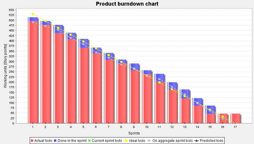
The product burn down chart (see Figure 20, “Product burndown chart�?) shows the remaining effort of the backlog. The bars represent the estimated and in the sprint done effort. The solid line shows the ideal trend of the remaining effort. The calculation of the ideal effort is the initial effort divided by the count of the sprints. The duration of the sprint isn't considered here.
The gray dashed line shows the sum of the estimated task durations. The value from sprint 1 is the sum of sprint 1 to sprint 17. The sum in sprint 2 is the sum of sprint 2 to sprint 17 and so on.
The dark gray dashed line shows the expected trend from the current sprint on. It is expected that the tasks from the current sprint will be done completly. The expected velocity is calculated from the velocity from the past sprints. In this line the sprint duration will be considered. The line is only significant if the team size remains equally.
![[Note]](common/images/admon/note.png) |
Hint |
|---|---|
|
If you name sprints in the form |


